
In the competitive real estate industry, branding is everything. A real estate logo serves as the visual foundation of your business, representing trust, professionalism, and reliability. But in 2025, designing a logo isn’t just about aesthetics; it must also respond to the growing trend of mobile-friendly experiences. With most clients accessing websites on their smartphones, your logo needs to look impeccable on smaller screens.
Your real estate logo is more than just a symbol—it’s your brand’s identity. It communicates your values, builds trust, and creates a lasting impression on potential clients. As mobile usage continues to dominate web traffic in 2025, having a logo that looks stunning on both desktops and mobile-friendly websites is a must. This article explores how to design the perfect real estate logo optimized for mobile-friendly websites with modern trends, ensuring boost your brand identity and attract more clients.
Table of Contents
The Role of a Real Estate Logo in Branding
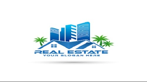
A Real Estate Logo plays a crucial role in developing a strong brand identity and encouraging trust with clients. It serves as the visual foundation of a real estate business, providing a professional and memorable image that reflects the company’s values and services. A well-designed logo can explain reliability, luxury, or modernity, depending on the target audience, and make a lasting impression in a competitive market. It also improves marketing efforts across various platforms, from business cards to websites. By offering a consistent, recognizable symbol that clients can associate with quality and expertise.
Developing Trust and Professionalism
A Real Estate Logo is a powerful tool for developing trust and professionalism in the real estate industry. As the first visual representation of a business, it plays a significant role in shaping potential clients’ perceptions. A well-crafted logo conveys credibility, reliability, and expertise, which are essential qualities in the real estate market. By choosing the right colors, fonts, and design elements, a logo can communicate the company’s values. Whether it’s luxury, innovation, or community focus. When consistently used across marketing materials and customer touchpoints, it supports a professional image, helping to develop long-term relationships with clients and build trust.
Standing Out in a Competitive Market
In the highly competitive real estate market, a Real Estate Logo serves as a critical element in helping a business stand out. A unique, memorable logo differentiates a real estate company from its competitors and makes a strong first impression. By incorporating distinct colors, fonts, and symbols that match with the brand’s values and target audience, a logo can capture attention and encourage recognition. In a crowded market, where many companies offer similar services, a well-designed logo not only boosts brand visibility. But also communicates professionalism and trustworthiness, making it easier for clients to choose your services over others.
Key Elements of an Effective Real Estate Logo
An effective Real Estate Logo is essential for developing a strong brand identity and conveying professionalism in a competitive industry. The key elements that contribute to a successful real estate logo include:
- Simplicity and Scalability
- Relevant Symbols and Imagery
- Typography and Color Psychology
By including these elements, a real estate logo can help a business stand out, build credibility, and attract clients effectively.
Simplicity and Scalability
When designing a Real Estate Logo, simplicity and scalability are two fundamental factors that determine its effectiveness and longevity.
Simplicity:
A simple logo is easily recognizable and memorable, which is crucial in a competitive real estate market. Overly complex logos can confuse potential clients and become difficult to reproduce across different mediums. A simple design ensures that the logo remains clear and impactful, whether it’s displayed on a business card or a large billboard. By focusing on clean lines, minimal elements, and clear visuals, a simple logo makes a lasting impression.
Scalability:
A scalable logo is one that maintains its integrity and legibility across various sizes and formats. Whether it’s shrunk down for social media profiles or enlarged for signage, the logo should look crisp and professional in any size. This is especially important for a real estate logo, as it will appear on a variety of marketing materials—both digital and physical. Scalability ensures that the logo works seamlessly across all platforms without losing its visual impact.
By prioritizing both simplicity and scalability, a real estate logo becomes a versatile asset that builds brand recognition and maintains its impact over time.
Relevant Symbols and Imagery
When creating a Real Estate Logo, including relevant symbols and imagery can significantly improve its meaning and impact. A well-designed logo is not just a visual representation but also a reflection of the brand’s core values and services.
1- Symbols:
Common symbols in real estate logos, such as houses, keys, rooftops, or buildings, immediately explain the nature of the business. These symbols help potential clients quickly identify the real estate services being offered. For example, a house icon can symbolize residential property services, while a key can imply access to new opportunities or properties. Choosing symbols that match with your specific niche (residential, commercial, luxury, etc.) ensures the logo connects with your target audience.
2- Imagery:
Imagery should complement the overall message the brand wishes to explain. For a luxury real estate business, sleek and elegant design elements such as gold accents or sophisticated lines can evoke a sense of high-end services. For a more approachable or family-oriented real estate business, imagery might lean toward warm colors and friendly icons. Imagery should always match with the company’s mission and the emotions it wants to evoke in its clients.
By carefully selecting relevant symbols and imagery, a real estate logo not only becomes visually impacting. But also communicates key factors of the brand’s identity, making it more memorable and meaningful to potential clients.
Typography and Color Psychology
When designing a Real Estate Logo, both typography and color psychology play pivotal roles in explaining the right message and developing a strong brand identity.
Typography:
The typeface you choose for your real estate logo speaks volumes about your brand’s personality. For instance, serif fonts (e.g., Times New Roman, Garamond) tend to evoke a sense of tradition, reliability, and professionalism, making them ideal for luxury or high-end real estate brands. On the other hand, sans-serif fonts (e.g., Arial, Helvetica) are clean and modern, often used to explain simplicity, approachability, and innovation. The font should be easily readable and scalable to ensure it works well across various marketing materials, from business cards to billboards.
Color Psychology:
Colors have a powerful influence on perception and emotions. In real estate logos, different colors can evoke different feelings:
- Blue: Represents trust, stability, and professionalism, ideal for building a sense of reliability with clients.
- Green: Symbolizes growth, renewal, and nature, perfect for eco-friendly or sustainable real estate businesses.
- Red: Explains energy, excitement, and urgency, useful for real estate agents focusing on fast sales or high-demand areas.
- Gold: Associated with luxury, wealth, and prestige, commonly used by luxury real estate brands to explain exclusivity.
- Black: Elegance and sophistication, often used in premium real estate branding.
By carefully selecting typography and colors, a real estate logo can effectively communicate your brand’s values and help develop the emotional connection needed to attract and retain clients.
Why Mobile-Friendly Design is Crucial
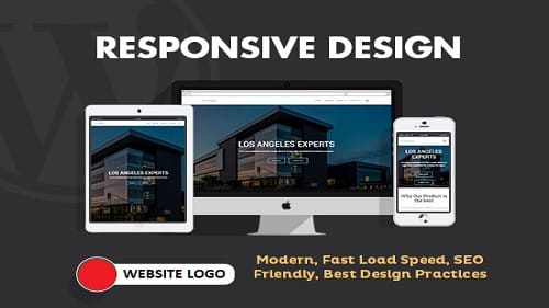
In today’s digital world, a mobile-friendly design is essential, especially for a real estate logo. With more people using smartphones and tablets to search for properties and browse real estate listings, ensuring your logo looks sharp and professional across all devices is vital for maintaining a strong brand presence.
Increased Accessibility:
Many potential clients use mobile devices to browse real estate websites, often when they are on the go. A mobile-friendly logo ensures that your branding is visible, clear, and easy to recognize, regardless of screen size or resolution.
Responsive Branding:
A logo that adjusts well to different screen sizes. Whether on a small mobile phone or a large desktop, creates a seamless experience for the user. This is crucial as inconsistent branding or logos that are hard to see on mobile can turn away potential clients and damage brand credibility.
Improved User Experience (UX):
A mobile-friendly real estate logo contributes to a smooth overall experience. Making it easier for clients to navigate your website and engage with your content. When your logo and website are responsive, visitors are more likely to stay longer, search more properties, and ultimately convert into clients.
Search Engine Optimization (SEO):
Google prioritizes mobile-friendly websites in its rankings. A well-optimized, mobile-friendly logo can indirectly help improve your website’s visibility on mobile search results. Ensuring that your real estate business is discoverable by a larger audience.
In short, a mobile-friendly design for your real estate logo is not just a trend. But a necessity to ensure accessibility, improve user experience, and increase brand visibility in the competitive real estate market.
Steps to Design a Real Estate Logo for Mobile-Friendly Websites
Creating a real estate logo that works seamlessly across all devices. Especially on mobile-friendly websites is essential for developing a strong, professional brand. Here are the key steps to ensure your logo is mobile-optimized and visually effective:
Keep It Simple:
A real estate logo needs to be clear and recognizable even on small screens. Avoid complicate details that can become lost or unclear when scaled down. Focus on strong, simple shapes and minimal text that explains your brand’s essence at any size.
Choose Scalable Fonts:
Typography is an essential part of a logo. Use fonts that are easy to read on both desktop and mobile screens. Ensure the text isn’t too small or overly complex. Opt for clean, bold fonts that remain legible on small mobile displays.
Test for Responsiveness:
The logo should adjust properly to different screen sizes without losing its impact. Test your real estate logo on various devices (mobile, tablet, and desktop) to ensure it looks great at any resolution. A responsive logo will improve user experience and increase brand recognition.
Use High-Quality, Scalable Graphics:
Choose vector-based graphics that scale without losing quality. SVG (Scalable Vector Graphics) files are perfect for logos, as they maintain clarity and sharpness on both high-resolution mobile screens and larger desktop monitors.
Prioritize Contrast and Visibility:
Mobile screens often have different lighting conditions, making visibility crucial. Make sure your real estate logo has high contrast, with colors that stand out and are visible in both bright and dark environments. This ensures readability, even in sunlight.
Optimize File Size:
A mobile-friendly logo should not only look good but also load quickly. Compress your logo files to reduce their size without compromising quality. Faster load times improve user experience and are essential for SEO performance on mobile devices.
Consider Branding Consistency:
Ensure your logo matching with the overall brand identity, from color schemes to imagery. Consistency is key to building trust and recognition, and it ensures your real estate logo is immediately identifiable across all platforms.
By following these steps, you can create a real estate logo that not only looks professional. But also improves user engagement and conversion rates on mobile-friendly websites. Providing your business a competitive advantage in online marketplace.
Tips for Creating a Memorable Real Estate Logo
A real estate logo is more than just a visual symbol; it’s a foundation of your brand identity and a tool for standing out in a competitive market. Here are key tips to create a memorable and impactful real estate logo:
Keep It Simple and Timeless:
A complex logo can be difficult to recognize and recall, especially in real estate where first impressions are important. Stick to simple, clean designs that are easy to remember. A timeless logo will also stay relevant as trends change.
Reflect Your Brand Values:
Your real estate logo should explain the essence of your business. Whether you focus on luxury, affordability, innovation, or reliability, make sure your logo reflects your core values and mission. This helps build trust and connects emotionally with potential clients.
Use Relevant Imagery:
Include symbols or icons that relate to real estate, such as homes, buildings, keys, or rooftops. However, avoid clichés and ensure the imagery matching with your unique selling proposition (USP). Subtlety is key for a polished look.
Choose the Right Colors:
Colors play a significant role in evoking emotions and influencing perception. In real estate, blue is often associated with trust and professionalism, while green represents growth and stability. Choose colors that match with your brand and the target market you want to attract.
Typography Matters:
The font you choose for your real estate logo should be legible and complement your overall design. Serif fonts exude traditional elegance, while sans-serif fonts feel modern and clean. Ensure that the typography is scalable and looks great in all sizes.
Make It Scalable:
A memorable logo should work well in a variety of formats, from large signs to website icons. Ensure your real estate logo is scalable without losing its clarity or impact, whether it’s displayed on a billboard or a mobile screen.
Differentiate from Competitors:
Research your competition and aim to create a real estate logo that stands out. A unique, innovative design can help set your business apart and leave a lasting impression on potential clients.
Get Feedback:
Before finalizing your logo, gather feedback from colleagues, clients, or even a focus group. This will help you identify any potential issues or improvements and ensure your logo connects with your target audience.
By following these tips, you can design a real estate logo that not only captures attention. But also reflects your brand’s identity, helping to develop a strong, memorable presence in the marketplace.
Common Mistakes to Avoid
One of the most important steps in developing a powerful brand identity is designing a real estate logo. However, several common design mistakes can undermine the effectiveness of your logo. Here are some key mistakes to avoid:
Overcomplicating the Design:
A logo should be simple, memorable, and easy to recognize. Overcomplicating the design with too many elements or complicate details can confuse potential clients and make the logo hard to reproduce across various platforms. Stick to a clean, minimalist design that communicates your brand’s values clearly and efficiently.
Ignoring Mobile Responsiveness:
In today’s digital world, many clients will view your real estate logo on mobile devices. A logo that looks great on desktop but fails to scale properly on smartphones can damage your brand’s perception. Ensure that your logo is versatile and maintains its clarity across all screen sizes. It making sure a smooth user experience on both desktop and mobile devices.
Using Generic Symbols:
Using clichéd or overly generic symbols, like a house outline or key, can make your logo blend in with the competition. Your logo should reflect your unique value proposition and set you apart from other real estate businesses. Instead of defaulting to generic imagery, aim for symbols that are distinctive and representative of your specific market or services.
By avoiding these common mistakes, you can create a real estate logo that is simple, mobile-friendly, and unique, helping your business stand out and make a lasting impression.
How a Great Real Estate Logo Boosts Business

A well-designed real estate logo can significantly contribute to the success and growth of your real estate business. Here’s how:
Improves First Impressions:
Your logo is often the first interaction potential clients have with your business. A professional, clean, and memorable logo creates a positive first impression and sets the tone for trustworthiness and expertise in the real estate industry. It positions your business as professional and reliable, which is essential when dealing with high-value transactions.
Strengthens Brand Recall:
A strong, distinctive real estate logo is an essential tool in building brand recognition. Clients are more likely to remember your business if your logo is unique and visually impacting. Over time, a recognizable logo can help your business stand out from the competition and make it easier for clients to recall your services when they need them.
Drives Engagement:
A well-crafted logo doesn’t just look good; it also encourages engagement. When your logo connects with your target audience, it acts as a visual cue that attracts attention and invites potential clients to explore your services further. A memorable logo can drive traffic to your website, increase inquiries, and encourage long-term client relationships.
In the highly competitive real estate market, a great logo acts as an essential branding tool that supports your credibility, encourages recognition, and improves customer loyalty, ultimately boosting your business.
FAQs
1- What makes a real estate logo mobile-friendly?
A mobile-friendly logo is simple, scalable, and retains clarity on small screens.
2- Can I design a logo without professional help?
Yes, tools like Canva and Adobe Illustrator allow you to create professional designs. But hiring a designer ensures a polished result.
3- How much does logo design cost?
Prices range from free (using DIY tools) to several thousand dollars for professional agency designs.
4- What are the best colors for a real estate logo?
Blue, green, and gold are popular as they explain trust, growth, and luxury.
5- How often should I update my logo?
Update your logo every 5-10 years to keep it fresh and matched with modern trends.
Conclusion
A mobile-friendly real estate logo is a critical asset for your brand in 2025. It not only reflects your professionalism but also ensures your business stands out in a competitive market. By focusing on simplicity, scalability, and modern design trends, you can create a logo that connects with clients and boosts your business’s success.
If you enjoyed this article about the real estate logo, share your thoughts in the comments below! Please visit www.uniqueincs.com for more valuable content and claim your free e-book. Plus, explore discounted Digital Marketing Products to boost your business!
Improve your digital presence with an innovative website design that seamlessly integrates style and utility. Connect with www.uniquewebonline.com, using the most current trends and technologies to create visually pleasing and user-centric websites customized to increase your brand. Always prepared to captivate your audience and make a lasting impression, Unique Web Online invites you to create a digital experience that distinguishes you. Explore our portfolio and get started on the path to a striking, responsive, and effective website today.